70s-style 3D labelling

I haven’t had much time for new posts recently, so here’s a quick look at some “3D-style” mapping.

Ibiza map
As you can see, it was a bit of a bargain – I always think you don’t need to spend much to get something interesting, as long as you have fun looking. Anyway, this is a 1973 tourist map of Ibiza, notable for the 45° viewing angle, giving an perspective view of the landscape.

Ibiza map

A number of buildings – mostly hotels, along with a cinema, petrol station, town hall, bullring, etc. – are drawn over the street network in a 3D style. I’ve mentioned before how I love a handmade style, and this map is especially ropey. The hotel labels are all at a slightly different angle, and the fonts are a bit all over the place too. I’m not sure what’s going on with the Hotel Hawaii – perhaps it’s the cartographer’s favourite hangout. The location billboards are all at odd angles too, and at first I thought there was a shadow behind the Carretera a Santa Ines sign, but it must be an arrow pointing behind the hills, like the signs for Carretera a Ibiza and Carretera a San Jose. The stacked label justification and alignment varies a lot too, and some of the labels in the bay are completely different: Bahia de San Antonio has a stepped baseline,  with all the characters staying upright, and Ferry Boats is curved. Both of these labels are in a different font, much more uniform, as if printed on the map some time later.
Ibiza map

The majority of the sheet is taken up with the inset map shown here. I love the limousine taxis, or are they buses? They’re certainly long enough. There’s more free rein given to fonts and label styles – maybe this map was actually put together by a number of different people. Interestingly, the street labels all seem to be arranged so there is no text over the junctions. For example, C. San Vicente, just behind Plaza de la Inglesia, is broken in mid-word, even though there are no other obstructions there.
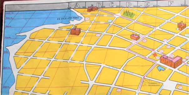
Ibiza map

Towards the top of the sheet, you can see how the grid lines converge towards the vanishing point, though the vertical lines seem to stop converging once you get past column A. There is not much detail up here – even the street casings are broken away from the junctions, as if these sections are not to scale or incomplete in some way.

A map like this, while not of very high quality, still demonstrates how cartography is as much an art as a science. There are many decisions to be made – like which points of interest to include, what colour scheme and  scale to use, how long to make your taxi symbols, etc. – that most people would be unaware of. As long as they can find their way to Dino’s Flamingo though, everyone’s happy.

Canvassing in Cardiff

It’s election time again; up and down the country, hundreds of volunteers will be pounding the streets, knocking on doors and trying to persuade reluctant voters into the polling booths. A successful campaign requires a lot of planning though, and, of course, a map. This old map of Cardiff seems to be just such a map; the electoral wards are shown, and a previous owner (as well as helpfully writing ‘CARDIFF’ on the cover just to make sure) has added lots of interesting annotations.

CoverLegend

It’s not immediately clear what the wards “shown thus” are for, but they are most likely to be local council wards. They equate roughly to the current Electoral Districts, give or take a few boundary changes, as seen in these screen shots from the Ordnance Survey election maps site.

Cardiff wards 1Cardiff electoral districts 1

Cardiff wards 2Cardiff electoral districts 2

Most of the annotations are likely to be house numbers, probably of known supporters or party workers, or maybe a boundary to show how far each volunteer should go along certain streets.

Address labelsAddress labels

The map is also interesting because it is shows a pre-war street layout. Large parts of Cardiff were bombed during WWII and all over town there are gaps or new builds between the terraced houses. Here though, all the streets are intact, and the original layout is still visible. Maps produced by Geographia often have a date code in the bottom left corner – I can just make out the letters E.BL. Substituting the digits 1234567890 for the letters CUMBERLAND, gives 5.47 or May 1947.

Publication date

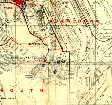
So, although it was published just after the war, a pre-war survey must have been used. Images 1 and 5 on this BBC News page show the damage at Blackstone St and Craddock St. The terraces were never rebuilt and a block of flats stands there today.

Riverside detail 

The other notable development since this map was produced is the redevelopment of the bay. Here we can see the old streets of Tiger Bay – birthplace of Welsh legend Shirley Bassey – and Cardiff docks: mile upon mile of railway sidings, bringing coal from the South Wales coalfield, to be loaded onto ships and transported across the world.

Tiger Bay

Cardiff detail

Bing map
[Apologies – Bing maps are more up to date than Google, but don’t embed properly in WordPress blogs. Click the image for an interactive version.]
As you can see, the coal tips have made way for a marina, lots of fancy apartments, Cardiff Whitewater, the Pont-Y-Werin footbridge, the International Swimming Centre, etc. etc. I’m intrigued by the old foot tunnel under the Ely though. I wonder if it’s still there…
Update:
My boss told me his neighbour used to walk through the tunnel, but it’s now blocked off. The Wikipedia Penarth page has this paragraph on the tunnel:
One feature of Penarth Dock was the tunnel underpass that connected Penarth dock to Ferry Road Grangetown under the River Ely (Welsh: Afon Elai).[8] Not quite wide enough for motor vehicles it was used by commuting pedestrians and cyclists as a short cut to work in Cardiff. The circular tunnel was about half a mile long with an entrance foyer at each end. Lined with cream and green coloured ceramic tiles the route was lit originally by gaslight and later by electricity. Completed in 1899, from parts cast by T Gregory Engineering Works, Taffs Well, the tunnel remained in use until the autumn of 1965 when it was closed and the ends bricked up, after a series of violent muggings, repeated vandalism and the cost of maintenance becoming uneconomical. The tunnel entrance at the Penarth end was located near the lock gates between the outer basin and the number one dock. This historic short cut route was ‘almost’ replicated and replaced in June 2008 with the opening of a pedestrian and cycle route across the new Cardiff Bay Barrage.
This article tells us a little more, including the toll: “1d for pedestrians, 2d for bicycles and 4d for prams.”

The birthplace of co-operation

Last week I took the kids to Touchstones museum in Rochdale, where amongst the exhibits on crossing the Pennines by foot/horse/canal/train/car, sending children to work in the mines, and famous Rochdalians (Gracie Fields, John Bright, err.. and some others), I saw these maps, taken from a Co-operative Wholesale Society booklet. Rochdale is, after all, the birthplace of the international Co-operative movement (although not according to some).

Apologies for picture quality, by the way. I was hoping I could buy these as postcards in the museum shop, but they weren’t there. Phonecam images will have to do.

Co-op Manchester

The first map shows Manchester, which, as we all know, is the centre of the universe, or it seems to be here at least. That great symbol of Mancunian stubbornness, the Manchester Ship Canal is shown, and I like how the label is written on the warehouses along the south bank of the canal, rather than trying to squeeze it onto the water. You can also see a steam train leaving the city, probably to symbolise the oldest passenger railway in the world.

I wasn’t sure whether the goods and services pictured around the edge of the map are particular to the towns they are connected to, or just a way to add a bit of interest to the design, but it turns out that Crumpsall is famous for its biscuits, people travel from miles around to see the famous Patricroft rope and twine, and Longsight appears to be the centre of CWS’s printing operation. I don’t think textiles and cotton weaving are restricted to Radcliffe though, they were prevalent throughout the whole area – Manchester wasn’t called Cottonopolis for nothing.

Co-op Liverpool

The next map shows the port of Liverpool and The Wirral, though the latter is notable only for a lighthouse and a tunnel leading to the big city (nowadays, it’s all golf courses and Premier League footballers). The sea has been painstakingly filled with a nice wave pattern – distinguishing it from the freshwater rivers and canals. There is not much else of interest shown here, apart from the Liver Building, some warehouses and goods, and the mouth of the ship canal. Perhaps, given the Co-op’s Lancastrian roots, and the long-running antipathy between Manchester and Liverpool, this area was deemed less important.

Co-op London

London: I remember when it was all fields around here. I couldn’t find a date on any of these pictures, but the cars in the Birkenhead tunnel look mid-20th century – late enough, certainly, for London to be more than a small cluster of buildings around St. Paul’s. Enfield, Lea Bridge, and Acton are marked as separate towns, though they are well within the Greater London conurbation nowadays. I consider everything within the M25 as “London” (though my parents, in Epsom, don’t get to vote for the mayor, so this isn’t strictly true), and these three places are all about half way out. Silvertown, a short distance down the Thames, is home to the Tate & Lyle sugar works, the City of London airport, and the Thames barrier. It is also well within the M25, so definitely counts.

Also shown are the CWS Reading print shop, boots from Bedford, chocolate from Luton, and non-Co-op-related tourist destinations Oxford (represented by Christ Church college, the Radcliffe Camera library, and A.N. Other dreaming spire), Windsor (whence came the less German-sounding name of our royal family) and the Chiltern Hills.

Co-op Newcastle

Finally, on to Newcastle, or, to be more precise, Pelaw, as most of the Co-op’s business seems to take place there. Also in the region: coal mining, North Shields fish market, cranemaking, and estates at Hetton & Holburn (not a vineyard as it looks like in the picture, but a farm estate). Local landmarks include the Tyne Bridge, and Hadrian’s Wall, which is shown passing through the city to its starting point at Wallsend.

I couldn’t tell how old these images were – they seem to belong in the heart of the industrial revolution, with all the steam trains, smoking chimneys, and warehouses, although the newfangled automobiles suggest they are more modern. Maybe they are supposed to be somewhat timeless, covering the entire history of an international organisation on the move.

You can bank on the Wales

I love browsing through second-hand book shops, charity shops, and jumble sales, looking for old maps. They say one man’s trash is another man’s treasure and you can often pick up some real gems for just a few pence. Some of the most interesting maps in my collection are just “throwaway” maps, produced by tourist boards, petrol stations, shopping centres, or, in this case, banks.

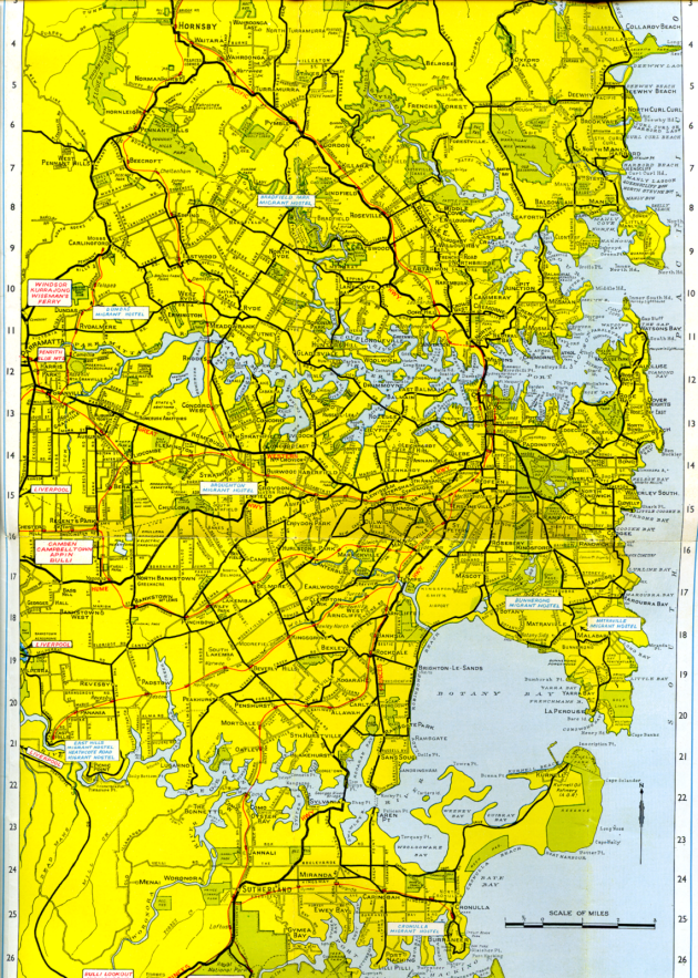
The Bank of New South Wales produced this lovely pocket map of Sydney and suburbs, with a bit of local history, public amenities, bank branch locations (very important, obviously), and interesting cartography thrown in.

Sydney and suburbs map cover

Turning it over shows a short history of Sydney and part of the index. Perhaps the cartographer was not aware this section was being added to the map, because the Tank Stream isn’t marked  – I couldn’t find it at least. It would have been nice to know whereabouts in the bay the city was founded.

City of Sydney history and index

Inside is a detailed map of the city centre, with area and street names, important buildings with key numbers to labels in the legend, and so on. Grid references are provided, but the lines are left out so the map does not appear too cluttered. I like the fact that you can tell this map is hand-made. The text size and shape is ever so slightly inconsistent, and there are one or two omissions. Perfection is overrated though, in my view – it’s like buying a loaf of bread from your local baker, rather than a plastic-wrapped plastic loaf from the supermarket.

Sydney city centre

There are a number of interesting details, most of which could be easily reproduced in a modern GIS package, but must have taken some time to draw correctly. In the examples below, the road casings are the same colour as the Haymarket label, so they have been split around it (1). Some names have been abbreviated – to show this has taken place, the last letter(s) of the word are in superscript, with a dot placed underneath(2). In the third example, Wattle St has been hyphenated to fit around the Macarthur St label. I haven’t seen this kind of fitting strategy before – presumably it’s not a a very popular solution.

1.Sydney example 1 2.Sydney example 2

3.Sydney example 3

All the street labels on the map are written in the same direction (bottom – top or left – right), so streets such as George St have been labelled upside down (4). I think there is a mistake on Haig Av – the ‘v’ is full size and the dot is to the right, instead of underneath it (5). In example (6), the text is drawn smaller to fit into the street feature.

4.Sydney example 4 5.Sydney example 5 6.Sydney example 6

A different font was used for the water feature names (7) – a chance for the cartographer to try out some different handwriting perhaps? And finally, a clue to when the map was produced. The famous Opera House was under construction between 1957 and 1973. If you look back at the front cover, there is in fact a small ‘7/62’ in the bottom corner, which may have been some kind of reference number, but is more likely to be a date.

7.Sydney example 7 8.Sydney example 8

Finally, a quick look at the suburbs section of the map – there aren’t so many interesting details here, although you do get a sense of the size of the city. It has indexes either side showing bank branches (again!) and suburb names, but it is slightly too big for my scanner, so just the map is shown here.

Sydney suburbs